課堂講義請看這:R Graphics with Ggplot2 - Day 3
這邊我們要用到檔案資料 diamonds。
|
library(ggplot2) library(dplyr) data(diamonds) |
我們先用 xtabs() 來看檔案中 color 的分佈情形。(xtabs() 的功能請看這篇。)
| xtabs(~ color, diamonds) |
Table 1
|
color D E F G H I J 6775 9797 9542 11292 8304 5422 2808 |
下面用 bar graph 看分佈,然後和上面做比對。
| ggplot(diamonds, aes(color)) + geom_bar() |
也可以分開設:(這個部分可以參考這篇會比較清楚)
|
d <- ggplot(diamonds, aes(color)) d + geom_bar() |
#1 (color only)

接著,來看看每種 color 的價格,這裡可以用 by() function 來看每種鑽石顏色的價格總整理(summary)。
語法:by(response var, predictor var, summary)
這裡的 predictor variable (又稱 explanatory or independent variable)通常是個 factor (不是數字),會放在圖的 X-axis,response (or dependent) variable 指的是對應 factor 出現的反應,因此通常是放在圖的 Y-axis。
| by(diamonds$price, diamonds$color, summary) |
Table 2
|
diamonds$color: D Min. 1st Qu. Median Mean 3rd Qu. Max. 357 911 1838 3170 4214 18690 ---------------------------------------------------------- diamonds$color: E Min. 1st Qu. Median Mean 3rd Qu. Max. 326 882 1739 3077 4003 18730 ---------------------------------------------------------- diamonds$color: F Min. 1st Qu. Median Mean 3rd Qu. Max. 342 982 2344 3725 4868 18790 ---------------------------------------------------------- diamonds$color: G Min. 1st Qu. Median Mean 3rd Qu. Max. 354 931 2242 3999 6048 18820 ---------------------------------------------------------- diamonds$color: H Min. 1st Qu. Median Mean 3rd Qu. Max. 337 984 3460 4487 5980 18800 ---------------------------------------------------------- diamonds$color: I Min. 1st Qu. Median Mean 3rd Qu. Max. 334 1120 3730 5092 7202 18820 ---------------------------------------------------------- diamonds$color: J Min. 1st Qu. Median Mean 3rd Qu. Max. 335 1860 4234 5324 7695 18710 |
也可以用 tapply() 功能來看。
| tapply(diamonds$price, diamonds$color, summary) |
|
$D Min. 1st Qu. Median Mean 3rd Qu. Max. 357 911 1838 3170 4214 18690 $E Min. 1st Qu. Median Mean 3rd Qu. Max. 326 882 1739 3077 4003 18730 $F Min. 1st Qu. Median Mean 3rd Qu. Max. 342 982 2344 3725 4868 18790 $G Min. 1st Qu. Median Mean 3rd Qu. Max. 354 931 2242 3999 6048 18820 $H Min. 1st Qu. Median Mean 3rd Qu. Max. 337 984 3460 4487 5980 18800 $I Min. 1st Qu. Median Mean 3rd Qu. Max. 334 1120 3730 5092 7202 18820 $J Min. 1st Qu. Median Mean 3rd Qu. Max. 335 1860 4234 5324 7695 18710 |
如果只想看平均值,就把 summary 改成 mean。
| tapply(diamonds$price, diamonds$color, mean) |
|
D E F G H I J 3169.954 3076.752 3724.886 3999.136 4486.669 5091.875 5323.818 |
在圖裡,可以用 summary_bin 這個功能來看,語法是:stat = "summary_bin"
或是:stat = "summary" (這兩個是一樣的)
summary_bin 裡面的功能有:fun.data, fun.y, fun.ymax (設最大值), fun.ymin (設最小值)
| ggplot(diamonds, aes(color, price)) + geom_bar(stat = "summary_bin", fun.y = "mean") |
在上面的語法裡,Y-axis 雖然已經設好是 price,但你需要在 geom_bar() 裡面的設定 Y-axis 是 price 的平均值(mean)或是中間值(median)等等,設定的語法是:fun.y =
也可以用上面的已設定好的 d <- ggplot(diamonds, aes(color)) 把上面的語法改成下面這樣:(上面的語法是把 Y-axis 設在 ggplot() 裡面,但是 d 裡面只設了 X-axis,所以在下面的語法中,需要把 Y-axis 設在 geom_bar() 裡面。)
|
d + geom_bar(aes(y = price), stat = "summary_bin", fun.y = "mean") |
#2 (color vs. price mean)

可以把圖和上面的 summary 表格做比較,看畫出來的是不是 mean。(和上面不同的是表一和圖一的指的是每種顏色的鑽石有幾個,所以圖 #1 的 Y-axis 是 count,而表二和圖二不只是每種顏色有幾個,而是每種鑽石顏色的價格,所以它的 Y-axis 指的不只是價格,還要指定是每種鑽石顏色的平均價格,還是每鑽石顏色其價格的中間值等等。)
下面來畫看看 median 的圖。
|
d + geom_bar(aes(y = price), stat = "summary_bin", fun.y = "median") |
#3 (color vs. price median)

除了用 geom_bar(),我們也可以直接用 stat_summary_bin() 或 stat_summary() 的功能。
stat_summary: summarise y values at distinct x values.
|
ggplot(diamonds, aes(color, price)) + stat_summary_bin(fun.y = "mean", geom = "bar") |
或是用上面設好的 d。stat_summary_bin() 和 stat_summary() 是一樣的東西,上面和下面的這兩個語法畫出來的圖和上面用 geom_bar() 畫出來的 mean 那張圖是一樣的(圖 #2)。
|
d + stat_summary(aes(y = price), fun.y = "mean", geom = "bar") |
我們也可以畫點圖,用 geom_point() 就是下面那樣:
|
ggplot(diamonds, aes(color, price)) + geom_point(stat = "summary_bin", fun.y = "mean") |
#4

上圖的 Y-axis 不是從 0 開始,而是從三千,我們可以把它設成從 0 開始。下面用上面設好的 d 和 stat_summary來畫圖,但基本上跟上面是一樣的,只是多了 ylim() 的語法。
ylim(min, max): Y-axis 的最小值和最大值
在下面的語法中,Y-axis 的最小值我們設為 0,最大值沒設,用 NA。
|
d + stat_summary(aes(y = price), fun.y = mean, geom = "point") + ylim(0, NA) |
#5

可以看到上圖的 Y-axis 是從 0 開始,而不是像圖 #4 那樣從三千開始。
接下來,試試在圖中加個 error bar,有四種方法。
注意,下面四種的預設都是 standard error (SE),除非你有指定另外的算法在裡面。
1. geom_pointrange(): vertical line with centre (中間點和其 error bar / standard error)
|
ggplot(diamonds, aes(color, price)) + geom_pointrange(stat = "summary_bin") |

我們可以改變點和其 error bar 的大小和顏色。
|
ggplot(diamonds, aes(color, price)) + geom_pointrange(stat = "summary_bin", size = 0.2, color = 'blue') |
| ## No summary function supplied, defaulting to `mean_se() |

summary_bin 裡面的 error bar 預設是 standard error (SE),你也可以把他設成別的,例如把它設成最大值 fun.ymax = max 和最小值 fun.ymin = min。
|
ggplot(diamonds, aes(color, price)) + geom_pointrange(stat = "summary", fun.y = mean, fun.ymin = min, fun.ymax = max) |

可以把 pointrange() 和其他圖合在一起,這裡要注意一下,放在後面的會覆蓋住前面的,所以需要把 geom_point() 放在 geom_pointrange() 後面,如果相反的話會在圖裡看不出 geom_point() 裡面的設定。下面把兩個用不同顏色和不同大小的點區分。
|
ggplot(diamonds, aes(color, price)) + geom_pointrange(stat = "summary_bin", size = 0.5, color = 'red') + geom_point(stat = "summary_bin", fun.y = "mean", size = 1.5, color = 'blue') |

Error bar 除了以上兩種外,也可以設其他的,例如讓它的範圍為中間 50%,最小值為第 25%,最大值為第 75%。
下面先用 group_by() 的功能把 color 分類,然後再用 summarize() 的功能在每種顏色裡算出其的價格。先把每種顏色的平均價格設為 y = mean(price),把誤差值(SE)的最小值指定為 ymin,設其為每種鑽石顏色的第 25%;把最大值指定為 ymax,設其為每種顏色的第 75%。
ps. quantile 分為:0 (0%), 0.25 (25%), 0.75 (75%), 1 (100%)
在下面先把算出來的指定為一個 data frame:df_color_price
|
df_color_price <- group_by(diamonds, color) %>% summarize(ymin = quantile(price, 0.25), ymax = quantile(price, 0.75), y = mean(price)), n = n()) |
|
# A tibble: 7 x 5 color ymin ymax y n <ord> <dbl> <dbl> <dbl> <int> 1 D 911.0 4213.50 3169.954 6775 2 E 882.0 4003.00 3076.752 9797 3 F 982.0 4868.25 3724.886 9542 4 G 931.0 6048.00 3999.136 11292 5 H 984.0 5980.25 4486.669 8304 6 I 1120.5 7201.75 5091.875 5422 7 J 1860.5 7695.00 5323.818 2808 |
上面語法中的 n() 是指在那個分類裡有幾個,在 R 裡面的解釋是:"The number of observations in the current group."(也就是說,上面得出的 n 的數字應該是要表 #1 裡的是一樣的。)
從上面的表可以看出 summarize() 算出每種鑽石顏色的平均價格(y)和前後 25% 的價格(ymin, ymax),還有每種顏色的鑽石有多少個(n),接著我們用這個 data frame 畫圖。
|
ggplot(df_color_price, aes(color, y, ymin = ymin, ymax = ymax)) + geom_pointrange() + geom_point(aes(size = n)) |
在前面 df_color_price 的語法裡加入 n = n() 是要讓點圖裡的點會依據每種顏色的數量呈現出不同的大小,例如在前面 pointrange() 的例子裡加入 size = 的話可以指定點的大小。之前都是設數字(例如 size = 2),但是在這裡設 size = n 的話,因為在前面已經設了 n = n(),表示 n 是每種顏色的數量的話,那點的大小就會因數量而異。
也可以把上面兩個語法用 %>% 合在一起。
|
group_by(diamonds, color) %>% summarize(ymin = quantile(price, 0.25), ymax = quantile(price, 0.75), y = mean(price), n = n()) %>% ggplot(aes(color, y, ymin = ymin, ymax = ymax)) + geom_pointrange() + geom_point(aes(size = n)) |

也可以和 geom_bar() 合用。
|
ggplot(diamonds, aes(color, price)) + geom_bar(stat = "summary", fun.y = "mean") + geom_pointrange(stat = "summary", size = 0.1, color = 'blue') |

在上面的圖中,因為每種鑽石顏色的 standard error (SE) 很小,所以看不出來。
可以用上面已經設好的 df_color_price 來畫圖:
|
ggplot(df_color_price, aes(color, y, ymin = ymin, ymax = ymax)) + geom_bar(stat = "summary") + geom_pointrange(size = 0.2, color = 'blue') |
因為在 geom_pointrange() 裡面並沒有設 stat = "summary",所以圖呈現出來的會是設在第一層 ggplot() 裡的 error bar (ymin, ymax)。
也可以用 %>% 把兩個語法合在一起,變成下面這樣:(這裡沒用 n = n() 是因為並非畫點圖,所以不需要。)
|
group_by(diamonds, color) %>% summarize(ymin = quantile(price, 0.25), ymax = quantile(price, 0.75), y = mean(price)) %>% ggplot(aes(color, y, ymin = ymin, ymax = ymax)) + geom_bar(stat = "summary") + geom_pointrange(size = 0.2, color = 'blue') |

下面把 geom_pointrange() 和 geom_line() 合在一起用。
|
ggplot(diamonds, aes(color, price)) + geom_pointrange(stat = "summary_bin", size = 0.2, color = 'steelblue') + geom_line(stat = "summary_bin", fun.y = "mean", group = 1, alpha = 1/2) |

geom_line() 裡面的語法可以參考這篇:ggplot | Regression Line & Grouping
2. geom_linerange(): vertical line (只有一條直線 error bar / standard error)
如果單用的話就會像下圖那樣只有一條線,所以通常會和其他圖和用。
|
ggplot(diamonds, aes(color, price)) + geom_linerange(stat = "summary_bin") |

可以和點圖和 bar graph 合用。和點圖一起用的話,其實畫出來的圖會跟只用 pointrange 差不多。你也可以幫 geom_linerange() 指定顏色,就是那條代表 SE 的直線,可以設成和點不一樣的顏色,如果直接用 pointrange() 的話就無法用不同的顏色。
|
ggplot(diamonds, aes(color, price)) + geom_point(stat = "summary_bin", fun.y = "mean", size = 2, color = 'skyblue') + geom_linerange(stat = "summary_bin", color = 'blue') |

同樣可以和 bar graph 合用。
|
ggplot(diamonds, aes(color, price)) + geom_bar(stat = "summary_bin", fun.y = "mean") + geom_linerange(stat = "summary_bin", color = 'red') |

預設的 SE 跟之前 pointrange 的圖一樣太小看不出來,下面再用之前設的 df_color_price 再畫一次。
|
ggplot(df_color_price, aes(color, y, ymin = ymin, ymax = ymax)) + geom_bar(stat = "summary") + geom_linerange(size = 0.5, color = 'steelblue') |

geom_linerange() 裡面的 size = 是條線條的粗細。
3. geom_errorbar(): error bars.
如果只有 error bar 的話是這樣:
|
ggplot(diamonds, aes(color, price)) + geom_errorbar(stat = "summary_bin") |

通常都是和 bar graph 合在一起用。
|
ggplot(diamonds, aes(color, price)) + geom_bar(stat = "summary", fun.y = "mean") + geom_errorbar(stat = "summary", width = 0.1, color = 'grey') |

geom_errorbar() 裡面的 width = 是用來設 error bar 的寬度。
下面用上面設好的 df_color_price 再畫一次。
|
ggplot(df_color_price, aes(color, y, ymin = ymin, ymax = ymax)) + geom_bar(stat = "summary") + geom_errorbar(width = 0.1, color = 'steelblue') |

4. geom_crossbar(): vertical bar with center.
終於來到最後一個。只用 geom_crossbar() 的話是這樣:
|
ggplot(diamonds, aes(color, price)) + geom_crossbar(stat = "summary_bin") |

用上面的 df_color_price 畫圖:
|
ggplot(df_color_price, aes(color, y, ymin = ymin, ymax = ymax)) + geom_crossbar(width = 0.2, color = 'steelblue') |

接下來我想用檔案資料 mpg,用裡面的 class (X-axis) 和 cty (Y-axis) 畫圖。下面跟前面一樣先做總整理。
| by(mpg$cty, mpg$class, summary) |
|
mpg$class: 2seater Min. 1st Qu. Median Mean 3rd Qu. Max. 15.0 15.0 15.0 15.4 16.0 16.0 ---------------------------------------------------------- mpg$class: compact Min. 1st Qu. Median Mean 3rd Qu. Max. 15.00 18.00 20.00 20.13 21.00 33.00 ---------------------------------------------------------- mpg$class: midsize Min. 1st Qu. Median Mean 3rd Qu. Max. 15.00 18.00 18.00 18.76 21.00 23.00 ---------------------------------------------------------- mpg$class: minivan Min. 1st Qu. Median Mean 3rd Qu. Max. 11.00 15.50 16.00 15.82 17.00 18.00 --------------------------------------------------------- mpg$class: pickup Min. 1st Qu. Median Mean 3rd Qu. Max. 9 11 13 13 14 17 ---------------------------------------------------------- mpg$class: subcompact Min. 1st Qu. Median Mean 3rd Qu. Max. 14.00 17.00 19.00 20.37 23.50 35.00 ---------------------------------------------------------- mpg$class: suv Min. 1st Qu. Median Mean 3rd Qu. Max. 9.00 12.00 13.00 13.50 14.75 20.00 |
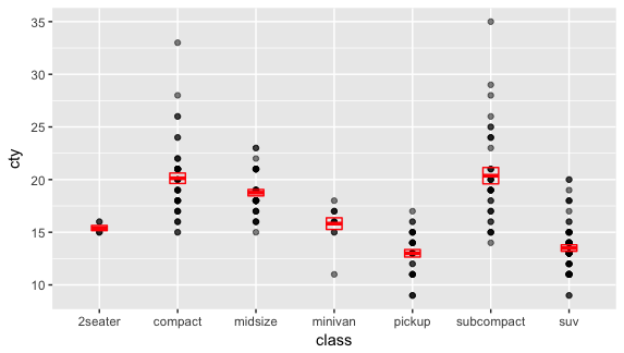
把點圖和 crossbar 合用:
|
ggplot(mpg, aes(class, cty)) + geom_point(alpha = 0.5) + geom_crossbar(stat = "summary", width = 0.2, color = 'red') |
也可以像上面一樣,把 error bar 設為中間的 50%。
|
df_mpg <- group_by(mpg, class) %>% summarize(cty_ymin = quantile(cty, 0.25), cty_ymax = quantile(cty, 0.75), y = mean(cty)) ggplot(df_mpg, aes(class, y, ymin = cty_ymin, ymax = cty_ymax)) + geom_crossbar(width = 0.2, color = 'steelblue') + ylim(10, 35) |
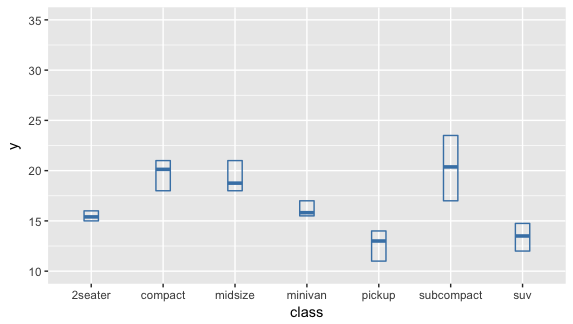
我把上面的 Y-axis 設了最大值和最小值 ylim(10,35),讓它和上面點和 crossbar 合圖的 scale 相同,比較好做比較。上面總整理的表格有 1st Qu. 和 3rd Qu.,Qu. 即是 quantile;1st Qu. 就是第一個 quantile,即第 25% ;3rd Qu. 是第三個 quantile,即第 75%。也就是說 1st Qu. 和 3rd Qu. 即是我們在 df_mpg 裡設的 cty_ymin 和 cty_ymax。可以把 crossbar 的最大值和最小值和表格裡的 1st. Qu 和 3rd Qu. 做比對,看看是否一樣。
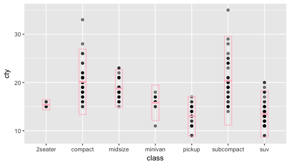
下面同樣是把點圖和 crossbar 合用,但是用 stat_summary() 來畫。在 error bar 的部分另外設成 sd,用的是 package "Hmisc" 裡面的 mean_sdl。
mean_sdl: smean.sdl computes the mean plus or minus a constant times the standard deviation
|
library(Hmisc) ggplot(mpg, aes(class, cty)) + geom_point(alpha = 0.5) + stat_summary(aes(y = cty), fun.y = mean, fun.data = mean_sdl, width = 0.2, color = 'pink', geom = "crossbar") |
mean_cl_normal: computes 3 summary variables: the sample mean and lower and upper Gaussian confidence limits based on the t-distribution.
| ggplot(mpg, aes(class, cty)) + geom_point(alpha = 0.5) + stat_summary(aes(y = cty), fun.y = mean, fun.data = mean_cl_normal, width = 0.2, color = 'pink', geom = "crossbar") |

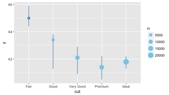
最後,來練習一下。
比較 cut 和 depth 的關係,用點畫出中間值(median)和中間 50% 的 error bar。
|
group_by(diamonds, cut) %>% summarize(ymin = quantile(depth, 0.25), ymax = quantile(depth, 0.75), y = median(depth), n = n()) %>% ggplot(aes(cut, y, ymin = ymin, ymax = ymax)) + geom_pointrange(color = 'steelblue') + geom_point(aes(size = n), color = 'skyblue') |
【 其他補充 】
有的地方可以看到 stat = "identity",這和 stat = "summary_bin" 有什麼不同呢?
stat = "identity" 通常是用在每個項目只有一個,例如在 diamonds 的檔案裡面,每個 color 的觀察只有一個,也就是說當你畫 price vs. color 的圖的時候,每個 color 裡不需要算價格的平均值或找它的中間值,因為就只有一個數(一個觀察)可以畫在 Y-axis。但是當資料變多的時候,也就是每種 color 裡面有好幾個,每個都是不同的價格的時候,那你畫 price vs. color 時就需要算出每種 color 的平均值,才能畫出 Y-axis,這時候就需要用 stat = "summary_bin" 來算出平均值或找出中間值。
另外,當你沒設 stat = " " 的時候,geom_bar() 裡的預設是 stat = "bin"。
在 ggplot2: geom_bar() 網頁裡的解釋是這樣:
The heights of the bars commonly represent one of two things: either a count of cases in each group, or the values in a column of the data frame. By default, geom_bar uses stat="bin". This makes the height of each bar equal to the number of cases in each group, and it is incompatible with mapping values to the y aesthetic. If you want the heights of the bars to represent values in the data, use stat="identity" and map a value to the y aesthetic.
其他網頁參考:
My ggplot2 cheat sheet: Search by task
R document / ggplot2: geom_bar() function
ggplot 2 / Bar charts
ggplot2 / Vertical intervals: lines, crossbars & errorbars
ggplot2 / Summarise y values at unique/binned x
沒有留言:
張貼留言
歡迎發表意見